Introduction
This second post outlines some steps for working with data that is generated by your daily work. For the background and earlier steps, see the first post (part 1).
Exploring your data
It's time to explore your data to discover what happened. Can you think of a way to answer your question, or to provide evidence about what happened?
If your dataset is large, it may be helpful to start with a smaller subset of the data, to make it easier for you to check your work, and make sure your analysis is sound, before you apply it to all the data.
Pivot tables
One of the best tools for exploring data is a pivot table. Pivot tables have a reputation for being a daunting, expert process, but once you know the basics it’s pretty simple. A pivot table is a way to compare how much or how many of something, divided into groups of something else. There are three main parts to a pivot table: Rows, Columns, and Values.
The examples below use two spreadsheets of data that I made up for this post. The one on the left shows data about how much department events cost. We might have a question like “How much are we spending on events?” The data on the right shows what might be the output of a patron signing up to use a library service with an online form. We might have a question like “Which of our services is used more?”
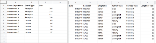
These two spreadsheets contain the data used in the examples below.
Values
Values are what make a pivot table useful, but they can also be confusing when you’re first starting out. To fill in the values field you need to know what you want to count and how you want to summarize it.
Here are some examples:
Since our question for the event data is about how much money the events cost, the value we want in the table is the cost. You can SUM these numbers, or AVERAGE them, depending which will answer your question best.
Since our question for the service data is about how many people used each service and the data is a signup form that requires patrons to enter their UofM Uniqname, the value might be Uniqname, and you might COUNTA them, which will tell you the number of cells in this row with something in them. (COUNT only counts numbers, COUNTA counts anything).
If you want to know how many different people used a service, you can summarize using COUNTUNIQUE, which will tell you how many different values show up in this field.
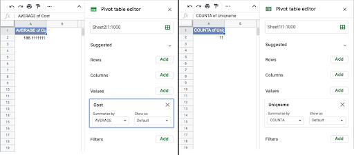
Sometimes all you need to know is the value. The pivot table on the left shows the average of the numbers in the field called cost.
The pivot table on the right shows how many rows have something in the field Uniqname.
If you are unsure of how a summarization method works, spreadsheet programs have documentation that is usually easy to find with a Google search. If you are using a small enough subset of your data, you can check the numbers by hand to make sure the summarization you’ve chosen is doing what you think it is, so you can be confident in your analysis once you apply it to all of the data.
Rows
Once you know what you are counting you can divide that count into meaningful sections based on what your question is and what information is in your data.
Do you want to know who is spending how much money on events? You can divide that count into rows by department. Doing this shows the average cost for each department, as well as the total average cost.
Do you want to know which service patrons use more? Divide the count into rows by service type. Doing this shows the number of patrons who used each service, as well as the total number of unique patrons.
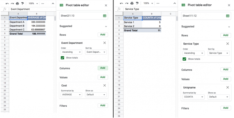
Once we divide our table into rows we can start to understand the data better. The table on the left shows us that Department A is spending a lot more on events than other departments, and the table on the right shows us that the two services seem to be used about equally.
Columns
Here’s where pivot tables get powerful and useful for exploring data: if you use a Row and a Column, you can see more complex relationships.
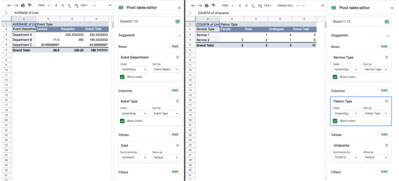
For example, with our event data, we might wonder what Department A is spending money on. Our data contains a field called Event Type. If we add that to the column suddenly our table gives us a better view of what’s happening. Department A spends a lot of money because they host the expensive kind of event.
In our service data we might think that our question about the use of our service might be more clear if we knew who was using each service. If we add patron type to the columns, we can see that both services are not used equally by all patron types. Maybe this is expected, maybe it’s a new insight!
By dividing the data into rows by one facet, and into columns by another facet, we can start to understand it.
The more complex your data is, the more exploring you might have to do to understand what the data can show. Using your questions to guide you, you can easily change the values, rows, and columns to explore lots of relationships.
What next
Once you’ve explored your data you may have one of several next steps depending on what you found, and what your goal for exploring the data was. Maybe you found you couldn’t answer the question, and need to find other information to fill in some gaps, but you should at least know what you need to know. That information may exist, or you might have to start collecting it. Maybe you answered your question, and you’re done. Maybe you want to share what you’ve found with others as a graph or table in a report.
If you want to share your data with others, the pivot tables you made can be used to make graphs and charts in your spreadsheet or presentation software. If you are going to use analytics software like Tableau or Google Data Studio, you will know which relationships to show. However you communicate the data, you should also communicate any relevant information about what the fields mean and what gaps or inconsistencies there may be. This will help your audience understand the data and prevent misunderstandings.