Introduction
Chances are the work processes you already have in place are generating data that you could be using to learn more about those processes. For example, maybe you have people fill out a form to register for a service. Maybe a digital tool you use to manage a process lets you export data about all the things you’ve done. Maybe someone has been faithfully updating a spreadsheet by hand for years (hopefully not!). You probably feel compelled to do something with that data, especially if collecting it has been part of someone's time and effort. You need to understand what the data can show but diving into piles of spreadsheets is daunting. This post outlines some steps for working with data that is generated by your work.
Start with a question
Whatever your data source is, there are sure to be multiple ways to analyze it, but just because you can show a particular view of the data, doesn’t mean it’s useful or worth the effort to do so. It can be overwhelming to dive into your data, and a lot of work to transform it from a folder full of .csv files into useful information. Having a clear reason to analyze the data will help you focus on what’s useful.
You may not know exactly what questions you are able to answer until you begin to analyze the data, but you should still start with an idea about what sort of questions you hope to answer, or what decisions you want to be able to inform. As you explore your data you can refine your questions based on what the data can show.
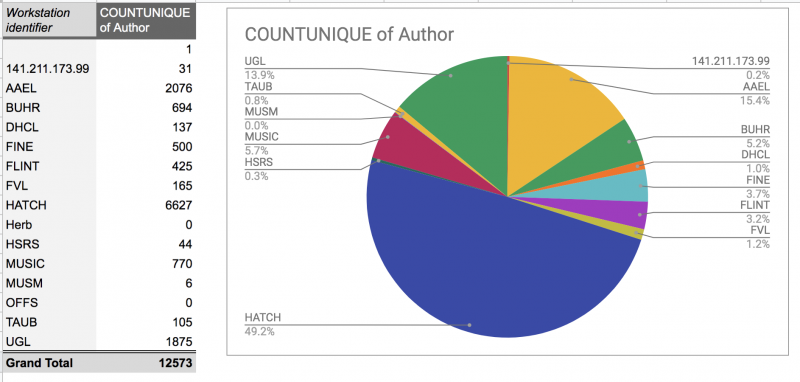
Google Sheets suggested this analysis of some Circulation data. While we can count the number of unique authors of items checked out at each location, this probably isn't a useful way to analyze the data. Knowing why you are analyzing the data can help you focus on getting useful information from your data.
Understanding your data
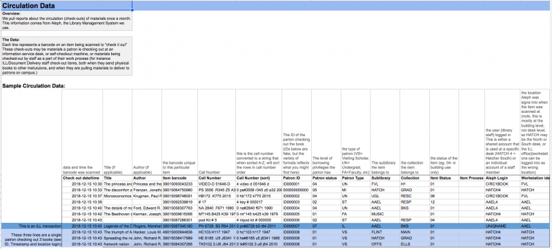
Once you have an idea of what you are looking for in the data, it’s time to dive in and see what the data holds. The first step to getting useful, and accurate analysis, is understanding what the data means. What does each row in the spreadsheet represent? What does each column mean? Your data is likely to be made of records of something happening (e.g. a patron making use of a service you offer), and your questions are likely to be about understanding the patterns or trends of what has happened (Who uses this service most? When do they use it most?). To confidently make claims about what happened, you need to understand where the data came from including:
- What caused the data point to be made? Something triggered the creation of each row of data, and caused the particular value.
- What are the rules for deciding what category something is? If your data contains types of transactions, or items, or patrons, what are the rules that decided how something was labeled?
- Are these processes automatic or manual? Is there room for error?
If you aren’t sure what actually makes the data points, the inferences and conclusions you represent in your final analysis may not be correct.
For example, in our Circulation data, the cell or field “Workstation Identifier” represents the building where the transaction took place, and “Aleph Login” represents the account used, with shared user accounts for specific Desks. Simple enough! But, both are manually set in the data collection interface, so it is possible for a workstation to be logged in as the wrong location, and while the shared desk accounts are usually used, supervisors may use their individual accounts (which allow them more admin options) when checking out books. Reconstructing what happened takes a little more work than just sorting by Login.
One of the things we’ve done for Library Operations data is to document our data sources as we discover these things, so there’s an easy way for anyone to look up what the data means.
Operations data sources have annotated sample data explaining where the data comes from and what each field means.
Knowing for sure what each field means and where it comes from is also important if you want to compare data from multiple sources. Don’t assume that just because field names and content are similar that they represent the same thing. For example, in a recent attempt to compare two data sources, the numbers just didn’t seem to line up, until we realized one of the sources had timestamps in a different timezone. That mistake was easy to catch once we made a graph, because it was easy to see it was shifted, but fields that represent categories, or types of something, may be harder to catch if you haven’t mapped the data first.
Once you’ve mapped your data, revisit your question: Does it look like these data fields are going to help you answer your question? Can you come up with more specific questions now that you know what level of detail was captured?
See the remaining steps for working with your data in my next (part 2) blog post.