When you visit the Hatcher Graduate Library, depending on which entrance you use, you’ll either be greeted by a friendly face at a service desk and a bank of elevators (the south building’s entrance) or marbled twin staircases, murals, and an open office where you can pick up or drop off materials (the north building’s entrance). You can even enter through a skybridge that connects our Shapiro Library to Hatcher. Or you can follow colored tape through the steel book stacks to a variety of doors or locations. Sound a little confusing?
It’s not uncommon for academic research libraries, especially large ones, to have multiple renovations that add a wing, a floor, or even a new building. The University of Michigan Library buildings on our central campus are no exception. Our undergraduate and graduate libraries form a complex -- the Hatcher Graduate Library features a 1920s North building, a 1970s South building and the Shapiro Undergraduate Library features 1950s bones in a 1990s shell. Many times a day, staff members direct visitors, patrons, or even a colleague to their intended destination.
In winter 2016, librarians and staff across the organization created a task force to address some of the challenges that emerged over the many decades of our libraries’ use and evolution. Our charge: improve user navigation in Hatcher and Shapiro through updating, replacing, and enhancing signage and match real-world wayfinding to web information. To get to these recommendations, we developed a research strategy that incorporated a variety of evaluations, methods, and user-centered approaches to identifying practical and effective solutions. We first conducted a needs assessment of library signs (so many photos!), an environmental scan, and created a supplementary report incorporating accessibility considerations.
Then we moved onto conducting user research. Through cognitive mapping, a survey and usability tests, we captured data about different user groups and how they navigate through the buildings to get to where they want to go. We focused on collecting data from users with different affiliations (faculty, undergraduate, graduate, staff), visit frequencies and abilities. (We plan to write more about our methods more specifically in future posts!)
By asking users to draw a map of the library from memory, or how they get to an area in the library they frequently use, we gained a snapshot view about their perceptions and use of the library, not just how they find their way around. We found that, yes, people still come to the library to find books. They also like to study in quiet areas within the book stacks. Bert’s cafe remains a popular place to connect with friends, grab a bite, and then move on to study elsewhere in our buildings.
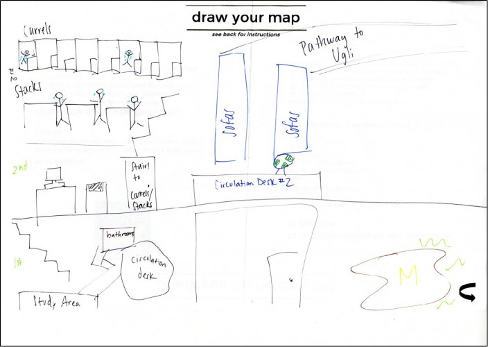
One person’s interpretation of the library, complete with students crying in the stacks.
By walking with our users through the libraries (during seven in person usability tests), we uncovered a variety of barriers to their successful navigation. The students who guided us through the stacks often got lost, confused, or frustrated. Because we have layers of buildings designed in different eras, compounded by layers of signage from different eras, we have unintentionally created a “mazelike” structure that we force our academic community to (often) self-navigate. We can’t start all over, so we decided to take advantage of some easy wins that we hope are making big improvements to how people find, and use, our library’s vast resources, tools, collections, and expertise.
We first started by removing outdated signs (we’re still working on this one) throughout the Hatcher North stacks and in Shapiro. After these signs were removed, we focused on adding a few key new signs, which we developed under our new guidelines based on accessibility standards. This included signs to some of our heavily used rooms, increased signage to our book stacks, and even re-taping the (very) old floor tape that leads you through the 1920s era book stacks. We took down a lot of “ad hoc” signage that staff had put up over the years.
While we have many layers of signs from various years, intents, and activities placed throughout our buildings, we didn’t have a cohesive “you are here” option for people getting their bearings in our buildings. We decided to create new maps (very large! very simple!), placed at our major entrances next to our elevator banks accompanied by a directory for each floor. By standardizing where we put these signs, their overall design and layout, and focusing on user-friendly terminology, we aim to lessen the cognitive burden folks faced when translating information into action in our buildings. Our strategy in creating these signs is focused on helping users overcome a barrier identified in our findings; that users often struggle to recognize where they are and where they can go next.
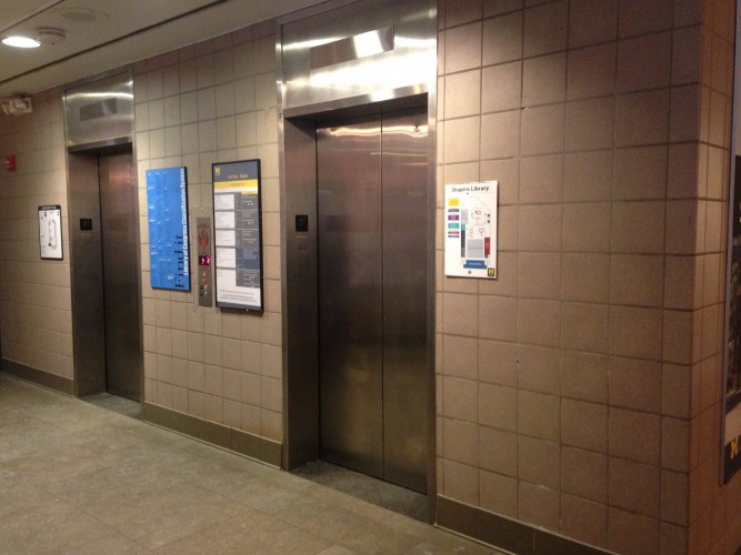
Before: the first floor elevators of the Undergraduate Library.
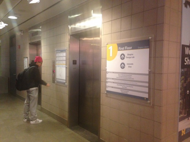
After: with new signs meant to help users recognize where they are, where they can go next and how to get there.
These efforts at standardizing some of our informational signage include re-designing our “stacks guides” (those directly-like lists of where you can find books by their call number). These are printed guides located at service desks and within the book stacks to help people find the right call number range for an item they may be searching for. We’ve now linked these guides to the directories in style and with some overlapping information, to help reinforce our directional signage throughout the buildings.
We’re still working on removing old signs, making tweaks and edits to our new directories, and planning for more evaluation and feedback. We’re also developing a standard practice guide and an overall ‘visual language’ for our buildings and the spaces within them so that when folks come into our buildings, regardless of the entrance, they can find their way through our spaces from one location to another. While we can’t change the historic layers of our physical buildings immediately, we are doing our best to make sure folks coming into our buildings can find what they’re looking for with confidence and (relative) ease.