The Usability Group and User Experience Department have partnered on a project to improve the display of library website search results. A search of the library's website using the default "MLibrary" tab currently retrieves:
- databases
- items listed in the Mirlyn catalog
- online journals
- research guides
- webpages from the library's website
- collections (both digital and other collections)
- items from the library's database of government documents
- items listed in the UM institutional repository, Deep Blue
- relevant library contacts, such as specific subject specialists and services
In each category, a maximum of 4-10 matches are displayed, depending on the category and the number of matches found.
This represents the library's combined search. Adjacent to the MLibrary search tab are separate tabs for ArticlesPlus and Mirlyn, which retrieve results from those systems only. Combined search, in contrast, is designed to aid discovery by displaying diverse kinds of search results.
The project undertaken by the User Experience Department and the Usability Group developed in part out of the library's implementation of ArticlesPlus in Fall 2010. For its initial implementation, ArticlesPlus was integrated into the library website as a separate search tab. The current project considers other options: should combined search include results from ArticlesPlus? If so, should those results be integrated into the existing design of search results pages or should we take a new approach?
To help us explore these questions, we examined how other websites -- from peer libraries to commercial sites -- organize multiple categories of results on a single search results page. We also compared search box designs, which inform the design of search results pages. The information we collected, below, represents the variety of design strategies employed to display complex and varied search results.
Combined Search Design & Feature Matrix
NCSU
Villanova
UCSF
Feature:
Number of search categories displayed
6: Articles, Journals, Books & Media, Databases, Library Website, More Search Options
Combined search includes “Books & More” and “Articles & More”
Combined search with results on 4 separate tabs
Number of columns
3
2
4 tabs, one column each
Collapsed results lists?
Yes, “More Search Options” (4): IR, NCSU theses & dissertations, Historical State, Google Scholar
None
None
Descriptive text with search results?
Yes, for Articles, Books & Media, and Library Website
Yes, similar to native Mirlyn search results pages
No
Lines between columns? Shading?
Lines – yes.
Shading – no.
Lines – yes.
Shading – yes, alternating between items.
N/A
Notes
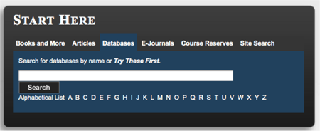
Penn State
- "Search for databases by name or Try These First" link under database search box provides straightforward directions for user. UM equivalent of "try these first" could be ArticlesPlus.
- The search box area is clean and well-organized.
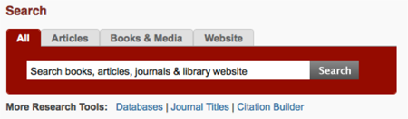
NCSU
- Search box under "ALL" search indicates exactly what is being searched: "search books, articles, journals and library website"
- Search box is clean, prominent, and clearly organized.
- Search result page has a lot of information on it but is surprisingly easy to look at.
- Features that contribute to readability:
- vertical lines between columns
- contrasting colors to distinguish headings
- collapsed results for "More search options" such as the institutional repository
- few results returned for each type with more information provided for each
- Best bets at top of results is a cool feature.
- "Books & Media" is a good label to describe catalog results.
- Databases are presented in two places and the distinction is confusing.
- Website search results are visually busy.
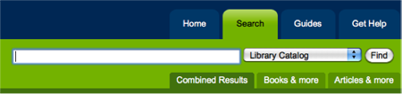
Villanova
- Drop down of fields in the search box visually delineates what will be searched.
- Books and articles are very prominent
- Where is other content, such as databases?
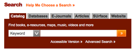
UCSF
- Tabbed design keeps search results displays visually clean and clear.
- Little – if any – descriptive information is provided for search results. More use could be made of the space that is gained through the tabbed design.
Syracuse
- "Help me choose a search" link above the Search box on the homepage is useful.
Oxford
- Tab to toggle between Oxford collections (catalog), and journal articles (article discovery tool)
- "Show only" links to limit to online or physical holdings.
- Institutional repository is subsumed in catalog (?), eliminating the need for a separate section of results from that source.
University of California
- Advanced search first displays counts for each search term, which are clicked to display results. Progressive disclosure of functionality.
Other Interfaces
Isotope.metafizzy.com
- Dynamic filtering
Authenticjobs.com
- Dynamic results refreshed when check boxes are unchecked.
Search Box Designs
NCSU
Villanova
UCSF

Syracuse
Oxford

http://solo.bodleian.ox.ac.uk/
Penn State
http://www.libraries.psu.edu/psul/home.html
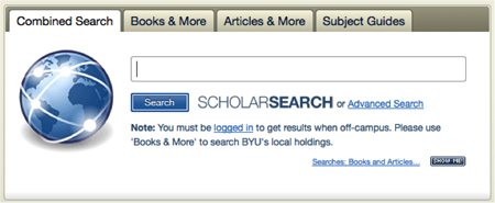
BYU
Authentic Jobs